Create a Gantt chart Using Microsoft Excel

Chart is a helpful tool for the monitoring a whole project progress. Gantt chart looks like a bar chart, it represents whole schedule of the project. By using Gantt chart it is easy to know about the start and end time of each sub task in a project.
There are lots of tools available in the market to create Gantt charts. However, you can also create a Gantt chart using Microsoft Excel. It is really easy.
Here are the simple steps:
Sponsored Links:
””

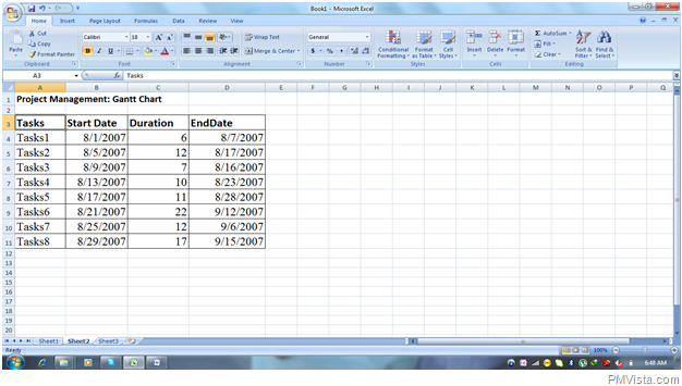
- Start the new worksheet and enter the project timeline data as a input in a excel spread sheet or enter the sample data in excel worksheet. Example: In an Excel sheet, make four columns for entering data with labelled Tasks, Start Date, Duration, and End Date.
- Click on the chart and select bar chart option. Select a Stacked Bar Chart using Chart Wizard.
- For selecting data for the stacked bar chart, right click on the chart and clicked on the select data option. Select data source dialog box will appear. In this dialog box click on add the series.
- By clicking on add, edit series dialog box will be appeared with series name and series values.
- Click on the series name and select the label name, start date in excel sheet. Click on the series values and select all the dates of the column start date in Excel sheet and click OK. Repeat the same operation with the column labelled Duration.
- For changing the Axis Labels, click on edit and fill the axis label range by selecting the all the tasks (Task1, Task2…..Taks8) under labelled Tasks. Click OK and you will see that under the Axis label name of the entire task are labelled. Now this is the starting of Gantt chart.
- There are two legends named Start Date and Duration. Select them both and delete them because for the Gantt chart there is no need of the legends.
- In the series you found the Blue Bars. To modify it Right Click on bars. Select Format Data Series. There are options Fill for that select no fill, For Border Colour select no colour and click on close button. Now you can found some appearance of the Gantt chart.
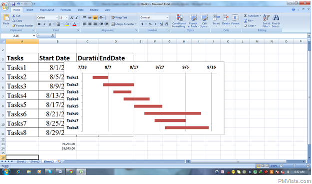
- There are a Labels Tasks1, Tasks2…..Task8 now format them by right clicking on it and choose option “Categories in reverse Order” and close. You can found the entire tasks in a specific order. In a chart you can found all the tasks and also found Tasks4 and Tasks5 overlap each other.
- . For the better view of chart, we have to change dates into the comma style (Display the value of a cell with a thousand separators). Enter your starting date and ending date of your project and convert it into comma style.
- . Right click on dates which are appeared on the chart, select format axis and enter minimum fixed and maximum fixed value i.e. starting and ending date of the project in a comma style. Click on close.
- . Now you can found little bit easy readable data in the chart. You can also change the format of the date by right click on date/format axis/number and select format of date. Gantt chart will be designed according to data.

Comments
| Tweet |
|